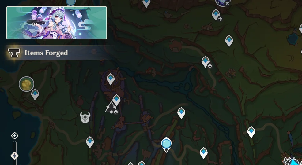
A new system introduced in Genshin Impact Patch 5.4 has sparked widespread frustration among players. The new quest recommendation notification, which appears in the top left corner of the map, is already being criticized for being intrusive, poorly designed, and unnecessary.
The system automatically suggests a quest that players should complete next, but instead of being a helpful quality-of-life feature, many find it disruptive and annoying which is leading to outcries on social media.
It’s not just story quests, it’s also Archon Quests, so for basically every new player it’s going to constantly be in the way on their map. The notification isn’t limited to side quests—it also suggests Archon Quests, which means that for any new or returning player who hasn’t caught up, it’s permanently stuck on their map. Players who prefer to explore at their own pace or focus on limited-time content now have a constant, unremovable prompt nagging them to complete quests they might not be interested in at the moment. As you can expect, this is annoying some players.
“It feels like an advertisement”. Players are speculating that HoYoverse’s data shows people aren’t playing quests on patch. Many players believe that this system was introduced because HoYoverse’s internal data shows that players are ignoring quests until later, rather than playing them as they release. Or perhaps, simply not doing quests at all. This aligns with recent changes that incentivize on-patch questing, such as:
- The free ascension materials given since Natlan’s release
- Primogems for completing story quests and exploration during the current patch
I know that I have several character quests that i’ve been unable to find time to complete such as Emilie‘s. Players have been saying that this system feels like an attempt to push players into doing quests sooner, but instead of a gentle nudge, it feels forced and pushy.
People are frustrated, especially on mobile, because players’ screens are much smaller. Unlike on PC or console, where screen real estate is larger, mobile users have significantly less space to work with. The new notification clutters the map UI, making it harder to navigate the map comfortably.
For many, this change feels unnecessary at best and frustrating at worst. With no option to disable the notification, players are hoping HoYoverse will address this backlash in a future update. Potentially by making this a toggle or simply making the UI element smaller.
